Discover how color psychology can change your space and improve your mood. Bright colors can make you feel alive, while calm colors help you relax. By choosing colors wisely, you can make your surroundings more uplifting and balanced.
We’ll explore the science of color and its history. You’ll learn how to use color to make your space better. This will help you create places that inspire and bring you peace.

Key Takeaways
- Understand the fundamental principles of color psychology and its impact on the environment.
- Learn how the strategic use of color can enhance mood, behavior, and overall well-being.
- Explore the historical and cultural influences that have shaped our perceptions of color.
- Discover practical applications of color psychology in interior design and space planning.
- Gain insights into the emotional and physiological effects of different color palettes.
Understanding the Fundamentals of Color Psychology
Color is more than just something pretty to look at. It can deeply affect our feelings, actions, and how we see the world. To really get color psychology, we need to learn about color perception and its history.
The Science Behind Color Perception
Color perception is a complex mix of our eyes and brain. Our eyes have special receptors called cones that catch light wavelengths. Then, our brain turns this into the colors we see every day.
Historical Perspectives on Color Psychology
Color psychology has fascinated people for centuries. Philosophers, artists, and scientists have studied it across cultures and times. From ancient Egypt to the Bauhaus movement, color has shown its deep impact on our minds.
Color Theory Basics
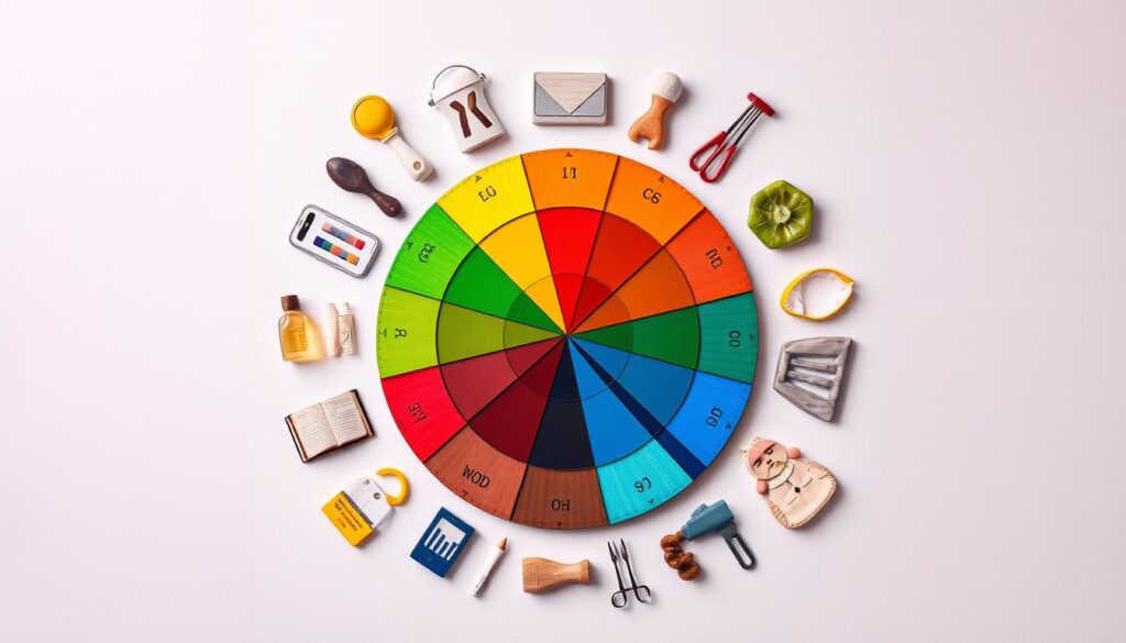
Color theory centers around the color wheel. It shows how different colors work together. By learning about primary, secondary, and tertiary colors, we can use color to create stunning and meaningful spaces.

“Color is the keyboard, the eyes are the harmonies, the soul is the piano with many strings. The artist is the hand that plays, touching one key or another, to cause vibrations in the soul.” – Wassily Kandinsky
Colors and Psychology: How the Color Palette Can Transform the Environment
The colors in a space can deeply affect how it feels and how people feel in it. The right color palettes can change a room’s mood and function. They can even change how people think and feel.
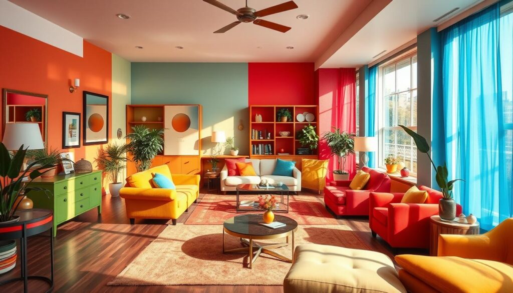
Colors can make us feel certain ways and create the mood we want. Warm colors like reds and oranges can make us feel energetic. Cool colors like blues and greens can make us feel calm. Neutral colors can balance a space, making it feel soothing.
Using color palettes wisely can also change how a room looks and feels. Light colors can make a room feel bigger and more open. Darker colors can make a room feel cozy and intimate.
“Colors, like features, follow the changes of the emotions.” – Pablo Picasso
Colors can also change how we think and feel. For example, some colors can help us work better, be more creative, or relax. This depends on what we want the space to be used for.

Designers, architects, and homeowners can use colors to make spaces that look good and feel right. By knowing how colors affect us, they can create spaces that improve our mood and change our environment.
The Impact of Primary Colors on Human Behavior
The primary colors – red, blue, and yellow – deeply affect our emotions and how we think. Each color has its own meaning and can make us feel certain ways. This makes them very useful in design and marketing.
Red: Energy and Passion
Red is all about passion and energy. It makes us feel excited, a bit aggressive, and warns us of danger. It can make our heart beat faster and our senses more alert. Companies might use red to grab our attention and make us act quickly.
Interior designers might add red to a room to make it lively and full of energy.
Blue: Calm and Trust
Blue, on the other hand, brings calm and trust. It can make us feel relaxed, lower our blood pressure, and make us feel safe. This color is often seen in hospitals to calm patients or in offices to show professionalism.
Yellow: Optimism and Clarity
Yellow is bright and cheerful, linked to optimism, clarity, and creativity. It can make us think better, focus more, and feel happy. Designers might use yellow in offices to boost energy or in kids’ rooms to make them feel welcome.
Knowing how primary colors affect us can help us use them wisely. This way, we can make spaces that evoke the right feelings and improve our surroundings.
Warm Colors and Their Emotional Effects
The colors we pick for our spaces deeply affect our feelings. Warm colors like oranges, reds, and yellows make us feel warm, comfortable, and full of energy. These color temperature hues change the mood and shape our emotional responses in big ways.
Colors in the warm color palette bring excitement, passion, and energy. They make spaces feel cozy and lively, perfect for places where we want to be active and social. Whether it’s a cozy living room or a bright dining area, using warm tones can boost our mood and make us feel welcome.
“Color is a power which directly influences the soul.” – Wassily Kandinsky
Studies show that warm colors can even make our bodies react, like our heart beating faster. This can help create lively and dynamic places, great for brainstorming or parties.
Knowing how warm color palette affects us, designers and homeowners can design spaces that match their goals. Whether it’s a happy kitchen, a lively office, or a snug reading spot, warm colors can change the feel of a room and improve our happiness.
Cool Colors and Their Influence on Mood
The impact of cool color palettes on our surroundings is immense. Hues like blues, greens, and purples can change how we feel and see a space.
Creating Peaceful Spaces with Cool Tones
Using calming colors in a room can make it feel calm and relaxing. Research shows these colors slow our heart rate and make us feel serene. They’re perfect for bedrooms and meditation rooms, where we need to unwind.
Professional Settings and Cool Color Applications
Cool color schemes are also great for workspaces. Offices and meeting rooms benefit from these calming colors. They help us stay focused and productive, and reduce eye strain.
“The right cool color palette can transform a space, promoting a sense of serenity and helping individuals to feel more grounded and focused.”
Using cool colors in design can greatly affect the mood of a space. By knowing how these colors work, we can create places that are good for our minds and spirits.
Using Color Psychology in Interior Design
Interior design is more than just looks; it’s about balance and function. Color is a key part of this balance. By using color psychology, designers can change spaces in ways that affect mood and well-being. This section looks at how color psychology is used in interior design.
Designers use color to play with space. Cool tones like blues and greens make rooms feel bigger. Warm colors like reds and oranges make spaces cozy. Bright colors can also draw attention to certain areas, adding interest and guiding the room’s flow.
Color also affects how a space works. For instance, calming blues and greens are great for bedrooms to help you sleep. Bright yellows and oranges boost energy in home offices. Choosing the right colors can make a room work better, creating a space that’s both beautiful and practical.
Color psychology in interior design is a powerful tool. It lets designers create spaces that are not only beautiful but also support well-being and productivity. This approach makes for spaces that are both stunning and useful.
Color Schemes for Different Room Functions
Color can change how we feel in our living and work spaces. In bedrooms, soft colors help us relax. In offices, bright colors boost our energy and focus.
Bedroom Colors for Better Sleep
The bedroom is our place to rest. Cool colors like blues, greens, and neutrals create a calm atmosphere. These colors help us sleep better by reducing stress.
Productive Office Color Palettes
An office needs colors that make us think and work better. Functional color design uses warm hues like yellows, oranges, and reds to energize us. These colors make us more creative and productive.
Kitchen Colors That Stimulate Appetite
In the kitchen, colors that make us hungry are best. Warm colors like reds, oranges, and yellows make us feel like eating. Greens and blues add a fresh touch to the space.
Knowing how colors affect us can improve our spaces. Use room-specific color schemes to make your home and office better. Try different colors to make your spaces feel just right.
The Role of Neutral Colors in Space Balance
Neutral colors like white, beige, gray, and black are key to a balanced space. They create a calm background for bolder colors. This makes your design both versatile and soothing.
Neutral colors help make a room feel balanced and peaceful. They give your eyes a break and let you add brighter colors easily. This is great for places like bedrooms or home offices where you want to relax and focus.
Neutral colors also make your design flexible and easy to change. You can add new pieces or colors without redoing everything. This makes your space look good for a long time.
“Neutral colors are the building blocks of a balanced and harmonious interior space. They provide a canvas for your design vision to thrive.”
In short, using neutral colors is crucial for a balanced and versatile design. They help create a space that looks good and can change with your tastes.
Cultural Differences in Color Perception
Exploring how colors are seen around the world is really interesting. Some colors mean the same thing everywhere, but others have different meanings in different places. Knowing these differences is key for marketing and designing for a global audience.
Eastern vs Western Color Symbolism
In the East, colors have deep spiritual and philosophical meanings. For example, red means luck and celebration in many Asian countries. But in the West, it’s seen as passion, danger, or anger.
White is a symbol of purity and mourning in Asia. But in the West, it’s about purity, cleanliness, and new starts.
Global Color Marketing Considerations
Understanding how people see colors is crucial for brands and designers. They need to think about how colors are seen in different places. A color that looks good in one place might not be right in another.
By understanding different cultures, businesses can make their brand more appealing worldwide. This helps them connect better with people from all over.


